

In forex trading analysis, it is very important to learn how to read forex charts available at forex trading platforms.
Learning how to read currency pairs historical data provided by trading charts reveals trends and patterns in the price movements.
The trends help forex traders to determine probable current and future price movement.
There are different types of forex trading charts that forex traders can use in technical analysis.
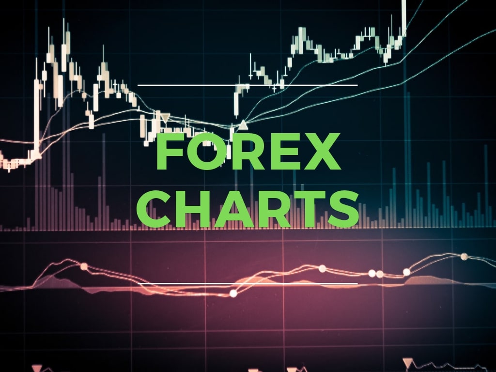
Reading Forex Trading Charts

Forex charts are graphical representations of a foreign exchange currency pair showing price movements in a timeframe.
The forex charts analysis provides useful information in a visual and organized way.
Reading forex charts is quick and straightforward.
The vertical line or y-axis represents price, while the horizontal line or x-axis represents time.
Forex prices are plotted from left to right across the timeframe; hence trends and patterns are viewed from left to right.
The time frame in the trading platform is divided into 1 minute, 5 minutes, 15 minutes, 30 minutes, 1 hour, 4 hours, 1 day, 1 week and 1 month.
The daily, weekly and monthly time frame suits positional trading, while the 4 hours and 30 minutes are ideal for day trading.
The remaining times suit scalpers and day traders.
Unlike in the pen writing days, computers have simplified things for us, and you can easily switch between the time frames at the forex trading platform just by clicks.
Live forex charts show both real-time and historical price data of the foreign exchange currency pairs.
Types of Forex Charts
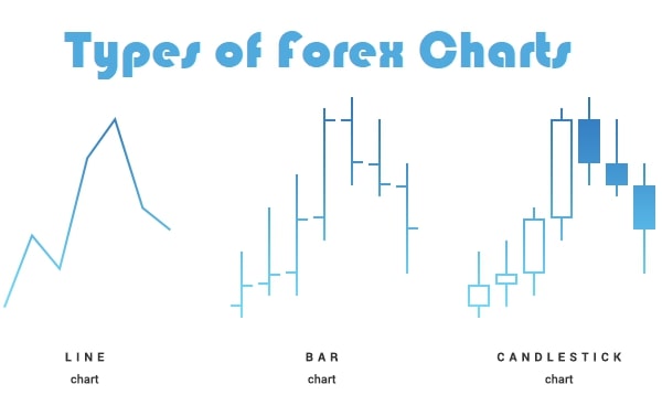
While several types of forex trading charts are available, only three are commonly used in forex trading charts analysis.
These three common types of forex charts include line charts, candlestick charts and bar charts.
Let’s examine them in details:
1. Line Charts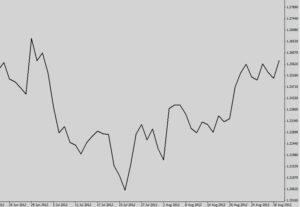
A forex trader finds no difficulty in reading line charts as it is straightforward and quick to understand but has the disadvantage of providing fewer details.
The line charts consist of a series of closing prices plotted against a timeframe forming a continuous line in a forex graph.
Traders may, at times, prefer this type of trading charts analysis as it provides price movement trends just at a glance.
It is easy to learn how to read line charts as it’s not cluttered with too much information.
Line charts are the basic form of graphical representation in the forex trading charts analysis.
Plotting line charts involves joining points representing closing prices to the next one starting from the earliest time to the latest.
In a nutshell, it is a series of closing prices in a graph just like the one you learned in elementary school.
2. Bar Charts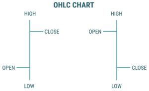
While being more advanced than the line charts, bar charts also known as OHLC forex trading charts consist of pips bars drawn in a time frame.
The pips bar shows both the opening and closing prices of a specific foreign exchange currency pair, compared to a line chart that shows only closing prices.
For example, a one-hour pip chart- each pips bar representing the hour- shows both the opening and closing prices within that specific hour.
In addition, forex traders easily have access to both the lowest and highest prices of the currency pairs within that hour.
Also, the upper part indicates the highest price within that time frame, while the lower part represents the lowest price.
The horizontal line on the left side reveals the opening price in that time frame.
To know the closing price within that particular time frame, the forex reader looks at the horizontal line on the right side of the chart.
The vertical height of the forex bar charts represents price ranges from the lowest to the highest in that particular time frame.
Additionally, OHLC charts show forex market volatility, which is not available with line charts.
3. Candlestick Charts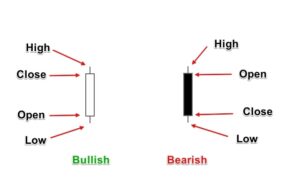
As the name suggests, candlestick charts consist of forex graphs that look like a candle.
A forex reader would quickly love this widely used and popular forex trading charts type.
It is similar to bar charts but has a candle-like graph at the spaces between the horizontal lines.
Bar charts and candlestick charts highlight the same information- opening, closing, low and high prices- for a specific currency pair within a timeframe.
The bar charts are modified to have two candles like graphs, one at the right and another at the left side of the forex bar graph.
The part between the closing price and opening price in the candle is called the body.
On the other hand, shadows are parts or projections outside the candle’s body at the top and below.
The candlestick Charts are further classified into Bearish and Bullish candles that are differentiated by colouring in the forex trading platform screen.
Bullish Candle
Bullish candles represent a bullish price movement signifying increasing prices within the timeframe under consideration.
The bullish candle is filled with white colour or left unfilled and hollow. In a bullish run, the closing price is higher than the opening.
Bearish Candle
Forex markets being highly volatile may undergo dropping prices, known as the bear run.
In the bear run, the opening price is higher than the closing price, meaning a reduced price of the currency pair within that time frame.
Traders can change the appearance of the candle charts at the default setting to make it more attractive.
Usually, traders prefer changing the colour of the hollow candle to green and the filled candle to red. Using green and red candles is advantageous.
This is because the interpretation of the coloured candles is simple and quick.
Besides, traders can add names to these forex trading charts to signify special changes in the forex market.
A red candle chart indicates a reducing price meaning the opening price was higher than the closing price.
In a bear run, candle charts are red. In the bull run, the candle charts are green, indicating a rising rate of foreign exchange currency pair.
Conclusion
While being very visual, charts help in understanding price movements, thus simplifying technical analysis.
As you learn how to read currency pairs, none of the forex trading charts is superior to the order.
All the charts are created using the same data but differ in their representation and interpretation.
Certainly, each type is unique, and traders can use one type or a combination of the forex charts for technical analysis.
During analysis, it is essential to use enough information on the charts as too much information causes confusion leading to bad decisions.